5 Important Features Your Website Should Have
Your company’s website is arguably the most important aspect of your business. It acts as the face of your company profile and is oftentimes the first place potential customers visit to understand your business. If you are a completely online store, then a fully functioning website is even more important, as this is the main method of conducting business.
With that being said, it is important you have a strong website created to attract customers and lead them down the path of conversion, which equates to more sales. What features make up the perfect website? In today’s blog, we’re touching on the 5 most important features you should make sure to incorporate into your website. These include:
- Good internal search engine
- Banners or pop-ups, including chatbots
- Strong visuals
- Seamless user experience
- CTA button
If you don’t have these features, you should get in touch with a developer or go into the backend of your web hosting platform to ensure these are added.
Once you do, you’ll see several positive effects, including:
- Increased web traffic
- Increased sales
- Less crashes
- More exposure
Now that you understand the importance of these website features, let’s get into more detail into each of them.
1. Good Internal Search Engine
A search engine on your website is essential for visitors to easily search your merchandise or browse your content and easily get to where they want to go. This is especially useful if your website has several pages to go through. It should be visible to the user and available on every page of your website.
If you don’t have a site search feature on your website, you should heavily consider installing one. If you do, here are some ways to optimize it:
- Visibility
- Optimized for mobile
- Powered by AI
- Informative and customizable
- Provides an alternative to “no results”
- Results ranked by relevance
- Search keywords highlighted
- Display product images with results
2. Banners or Pop-Ups
Your website should also have banners and pop-ups that promote a discount or have a call to action to input their email and sign up for updates. Such banners and pop-ups can appear at the top or bottom of a page when first visited by the user, or it can literally pop up in the middle. There are several plugins available like Sumo that make it easy to install and customize a banner or pop-up for your website.
You should also consider chatbots as an interactive way to provide simple customer support to your visitor. A chatbot can appear at the corner of your webpage and allows visitors to interact with a virtual customer service agent. This is an easy way to give extra value to visitors of your website.
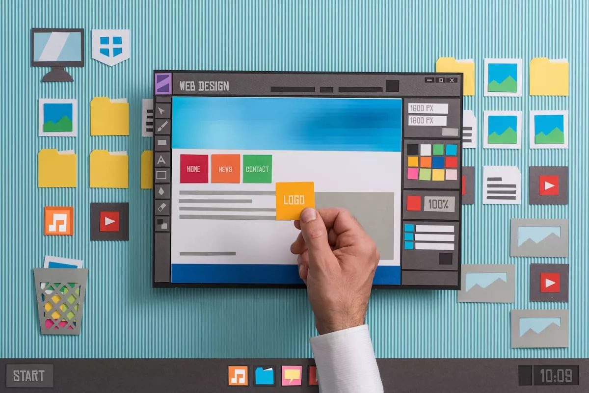
3. Strong Visuals
Next, your website should have strong branding with the appropriate colors and high-resolution visuals. Perhaps include some animation to make your website engaging. This is your chance to showcase the personality of your company brand. You want to make it exciting for the user so that they are more enticed to stay on your website, browse through it, and ultimately buy something.
4. Seamless User Experience
Surveys indicate that 94% of people say easy navigation is the most important website feature. User experience (UX) refers to the visitor’s journey through your website. When someone lands on your webpage upon clicking on the link, are they directed to a messy webpage with no clear path to follow to get them to where they want to go? Or, is everything presented clearly so that the user is encouraged to stay on your webpage longer and browse through it?
It’s simple: good UX means higher conversions. How do you ensure your website has a seamless UX? Here are some pointers:
- Use CTA buttons
- Use colors
- Keep things simple
- Always include a menu bar with a homepage button
- For ecommerce, keep the user’s cart visible at all times
- No lagging or website crashing
- Readable fonts and organized webpages
5. CTA Buttons
Lastly, your website should have plenty of CTA buttons enticing users to read more, buy now, or visit another part of your website. This ties in with the user experience we just touched on. Think about how you can strategically place such buttons throughout your website, such as in the middle of a blog, so that users are more likely to interact with it.


